Retail ready packaging brand design checklist every founder needs
Launching a product? Great. But here’s something you need to know - your product alone won’t cut it on the shelf. Packaging is your frontline. It needs to grab attention, build trust and tick all the boxes retailers demand. If you want to get retail shelf space, your packaging has to be retail ready. So what does “retail ready packaging” mean from a brand design perspective? Here’s a sharp retail ready packaging brand design checklist to make sure your packaging not only looks the part but actually works in retail.
Retail ready packaging isn’t just pretty wrapping. Retailers want packaging that sells, protects and makes their lives easier. Too many founders miss these nuts and bolts and end up rejected or forgotten on shelves. Your packaging has to deliver on brand consistency, shopper engagement and retail practicality. Otherwise, you’re dead in the water.
retail ready packaging brand design checklist
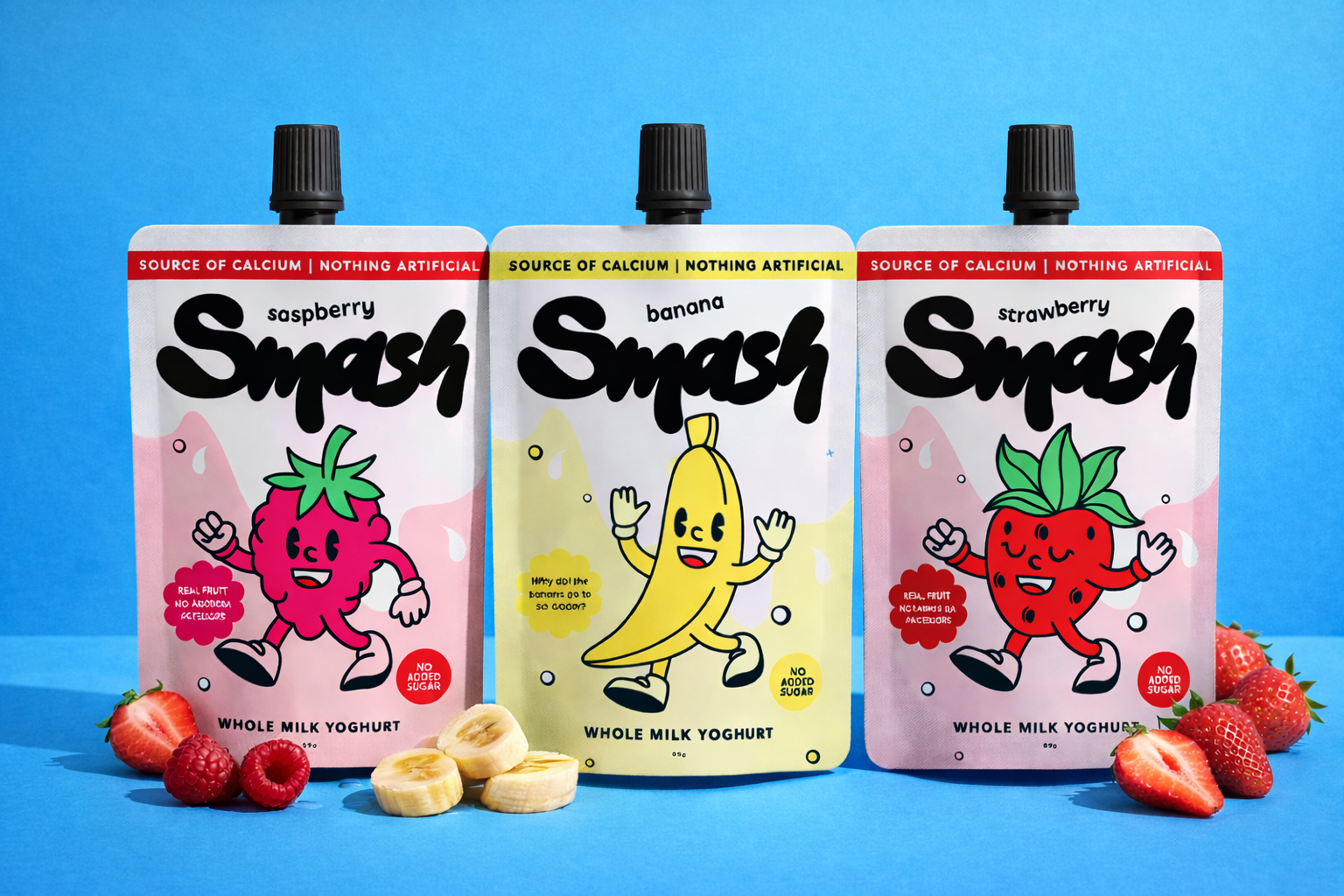
Your packaging has to scream your brand. No exceptions.
Consistent brand colours and typography. Familiarity wins. Drift off brand guidelines and you look sloppy or confusing.
Logo that’s big, bold and visible. Hidden or tiny logos get ignored. Contrast and prime placement are key.
Visual hierarchy that tells shoppers everything immediately: what the product is, who it’s for and why they should care. Don’t force customers to squint or guess.
Shelf space is fiercely competitive. Your packaging should shine like a beacon, not blend into wallpaper.
Compliant and convincing copy
Packaging copy is as important as the design, It needs to:
Meet regulatory requirements. Ingredients, allergens and certifications must be crystal clear. Retailers won’t entertain anything less.
Speak directly to the shopper. Cut the jargon. Use conversational, clear language that hits their needs.
Highlight real benefits. Forget vague claims. Say things like ‘BPA free’ or ‘made with real organic oats’ where relevant.
Your copy is your brand voice. Keep it consistent, confident and real.
Packaging format and structure aligned with retail needs
Graphics aren’t the whole story. The packaging itself must suit retail demands.
Fits standard retail shelves and displays. No one wants awkward sizes or shapes that waste space.
Protects your product. No ripped edges or crushed corners. Retailers won’t stock damaged goods.
Easy to open and reseal if needed. If customers can’t get into it, it stays on the shelf.
Showcase your brand on every side - retail is messy and unpredictable, if your packaging is left sideways on the shelf, it still needs to show who you are and what your product does.
Make sure your design team works closely with manufacturing to get the balance right between look and function.
Visible and practical barcodes and labels
There are minimum sizing for elements like this for a reason - no scannable barcode equals no retail sale, simple.
Barcode needs a flat, quiet spot - no folds or seals.
Include any other necessary labels like price or country of origin.
Retailers are strict with this. Don’t give them a reason to reject your product. You need a packaging designer that understands the importance of these elements, don’t settle for less (aka buy cheap, buy twice!).
sustainability messaging and materials (if relevant)
Sustainability isn’t optional for many shoppers now. From a brand design point of view:
Choose materials that back up your environmental claims - think recyclable, compostable or minimal.
Make your sustainability messaging clear but honest. Don’t overpromise.
Use recognised icons like the recycling symbol or FSC certification.
Retailers appreciate brands that meet consumer demand without complicating logistics.
cohesive range and brand architecture
Multiple SKUs? Your packaging needs to work as a family.
Repeat core design elements for unity.
Use colour or shape to differentiate products quickly.
This makes it easier for retailers to stock and customers to find what they want. Fragmented packaging screams amateur and confuses buyers.
If you want shelf space, your packaging has to do far more than look nice
It must deliver on visual impact, retail practicality and legal compliance. Use this retail ready packaging brand design checklist as your guide to make sure your packaging earns its spot in front of real customers. Some additional practical tips to consider and follow:
Test at shelf scale. Place your mock-ups next to competitors’ products and judge impact.
Get honest feedback from shoppers. They’ll spot confusing messaging or weak visuals.
Involve your manufacturer early. Late design changes cost time and money.
Consider store lighting. Designs that look great on screen can fall flat under fluorescent lights.
Struggling to pull this together? Good brand design is a sharp weapon. I help founders turn products into retail winners. Reach out if you want to chat about what retail ready packaging could look like for your brand.
Want to create packaging that stands out? Explore our packaging design services.
Found this blog engaging? Dive into more insights with our related blog on the packaging trap most FMCG founders fall into.