The packaging trap most FMCG founders fall into: trading boldness for safe designs
If you’re building an FMCG brand, you know shelf space is a battlefield. Your product isn’t just about price or quality - it’s about winning attention in a fraction of a second. Yet so many brands play it safe with their packaging. Opting for cautious, ‘nice’ designs might feel like the smart move, but that’s often the pitfall holding FMCG brands back.
Let’s get real about why bold packaging design for FMCG brands is an absolute must. Founders who dare to push boundaries grab more than attention, they own their space in crowded markets.
why bold packaging design for FMCG brands is non-negotiable
Launching a product with a small marketing budget? Your packaging is your frontline marketer. Bold design is what cuts through shelf chaos. And with more players squeezing onto shelves every day, blending in is just not an option.
Bold doesn’t mean screaming or going overboard. It means clarity, confidence and standing apart. Whether through colour, typography, shape or messaging, your packaging needs to slam the door on ‘forgettable’.
Look at the brands that dared to be different - Innocent Drinks’ quirky illustrations, Oatly’s unapologetic typography, or Candy Kittens’ bold, disruptive take on sweets. Theydemand attention on the shelf and create a memorable impact on customers.
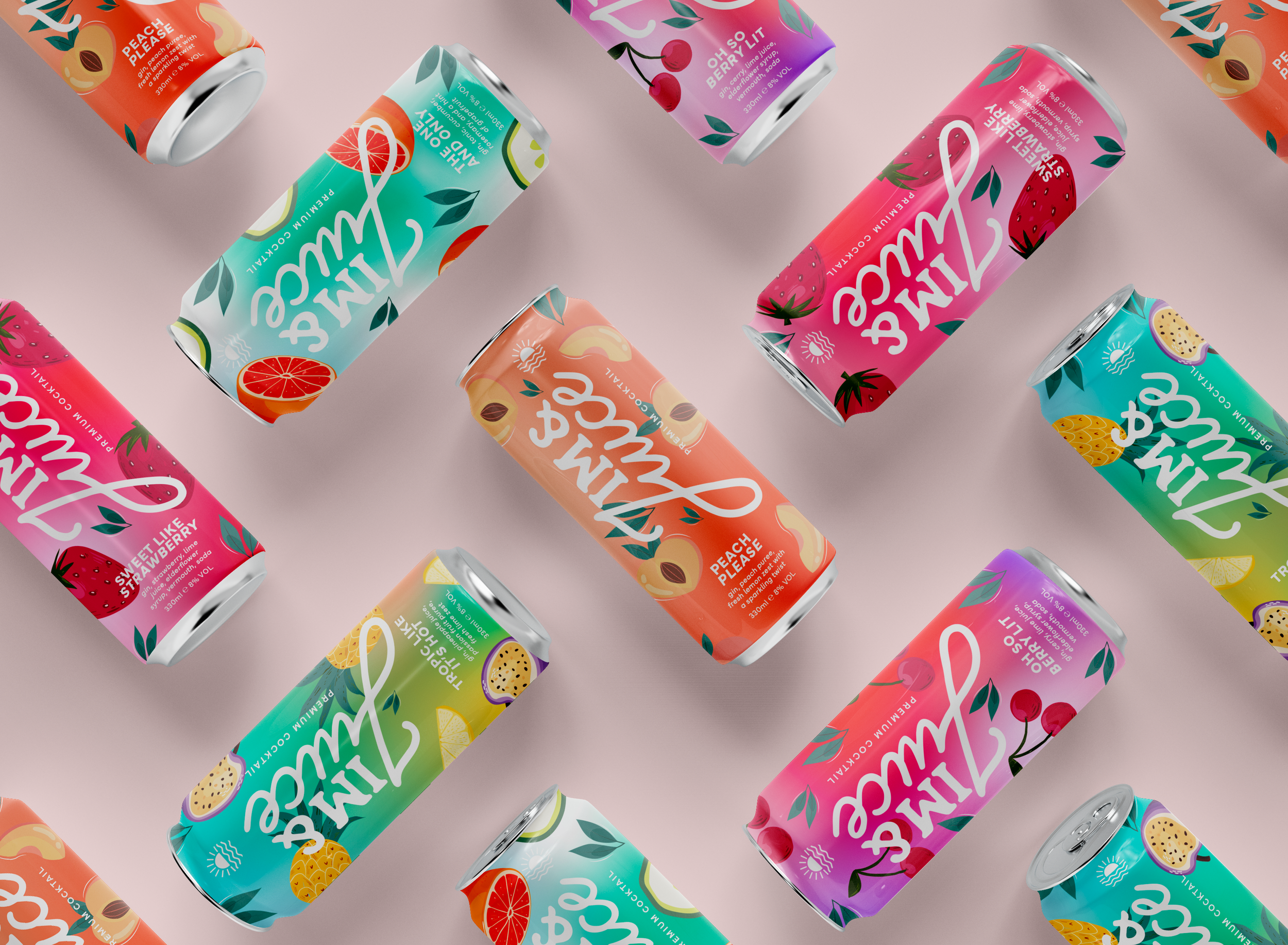
FMCG Drinks Can Example
the illusion of safety in ‘safe’ packaging
Many founders fall back on safe, minimal designs hoping to appeal to everyone. The thinking: familiar = friendly = buyers won’t run away.
Safe packaging fades into the background, lost in a sea of shouting competitors. When shoppers face endless choices, your product can’t just whisper its qualities, it needs a bullhorn.
Safe designs usually mean dull colours, generic fonts and forgettable visuals. The worst part? They telegraph hesitation and uncertainty about your own product’s worth. That kills confidence before anyone even picks up your item.
what real bold packaging looks like
Bold packaging isn’t neon lights and chaos, though it can be where needed. Here’s what smart bold looks like:
Distinctive colour palettes: Break from category clichés. If everyone’s pastel, try rich jewel tones or stark contrasts.
Unique shapes and formats: Don’t just label differently - rethink the form. Texture, closures, and bottle shapes that stick in people’s minds.
Typography with attitude: Fonts that breathe your brand’s personality. Bold doesn’t mean loud, it means alive and distinct.
Clear, confident messaging: Say what your product is and why it matters. Cut the clichés and get straight to the point.
Visual storytelling: Use graphics or illustrations that deliver your brand story instantly. Add personality and create connection.
bold packaging that gets results
Living Things: Punchy colour blocking and expressive type make functional drinks feel exciting and culturally relevant.
Surreal: Playful, unexpected branding in a traditionally dull category - proving personality can completely reframe perception.
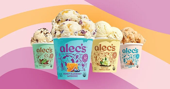
Alec's Ice Cream: Premium meets bold with rich colours, confident typography and a clear point of view that’s getting attention fast.
These brands get that packaging isn’t just about ingredients. It’s attitude, connection, and selling an experience in one look.
how to keep boldness without losing control
Know your audience: Bold packaging won’t suit everyone. Get inside your consumer’s head so your risks pay off.
Partner with experts who get boldness: Designers specialising in bold FMCG packaging know how to balance creativity with legal, production and retail realities.
Test before launch: Real feedback beats guesswork. Try your packaging in stores or focus groups to fine-tune.
Balance looks with function: Packaging must protect, comply and perform on shelf. Bold needs to be smart, not reckless.
Don’t chase trends blindly: Authentic boldness beats copying styles. Build a look that feels true to your brand story.
why founders need to stop settling
Packaging is your first handshake with a customer. Playing it safe means getting lost behind louder competitors. Bold packaging means quicker sales and stronger brand love.
Rebooting your approach to be confidently bold isn’t just creative - it’s essential to surviving and thriving in FMCG, where impulse rules.
need some help with your FMCG packaging design?
If you’re done blending in and ready to make your packaging your strongest asset, let’s talk. Helping FMCG founders craft bold packaging design for FMCG brands that cuts through the noise and builds lasting connections is exactly what I do. Your brand deserves to stand out boldly, not fade quietly.
Want to create packaging that stands out? Explore our packaging design services.
Found this blog engaging? Dive into more insights on three packaging design techniques to disrupt the shelf in retail the benefits of investing in your branding! Check out our related blog on three packaging design techniques to disrupt the shelf in retail Expand your branding knowledge and stay ahead of the competition.